Good hotel lighting can calm a guest or leave them squinting at a harsh bulb. Visual comfort is the design idea that separates the two. This guide explains visual comfort in plain terms for designers and architects meeting the topic for the first time.
You will learn what the word means and why it matters in hotels. We cover how glare is measured with a metric called UGR, along with practical targets for glare and light levels. From there we go a level deeper, into the fixture-level factors that actually produce visual comfort or ruin it: the shade or diffuser over the lamp, the bulb’s color rendering index (CRI), and its lumen output. Then we walk through comfort in guest rooms, bathrooms, corridors, and lobbies, and close with a checklist you can use on your next hospitality project.
What Is Visual Comfort in Lighting?
Visual comfort is lighting that lets people see clearly and relax without glare or eye strain. It comes from managing brightness and contrast so no single source overpowers the eye.
Glare is the harsh sensation you feel when part of your view is much brighter than the rest. The IES defines glare as the sensory response to a luminance sufficiently greater than the one the eyes are adapted to, to the point that it causes annoyance, discomfort, or a loss of visibility.
Luminance is the brightness of a surface or light source as the eye sees it. When one surface is far brighter than its surroundings, the contrast becomes uncomfortable.
One note on the name. Visual Comfort is also a lighting brand, and in this article the term refers to the design principle.
Why Visual Comfort Matters in Hotels
Comfortable lighting shapes how a guest room or a lobby feels. It affects how well guests rest and how safely they move through a space after dark.
Glare in the wrong spot creates real problems. A bright bedside lamp or an unshielded vanity fixture draws complaints. It also makes a space feel cheaper than it is.
Visual comfort also ties directly to brand standards. A guest who sleeps well and reads without squinting rates the room higher. Our guide on lighting and guest comfort shows how consistent lighting keeps the guest experience repeatable across every property in a portfolio.
How Glare Is Measured: Understanding UGR
Visual comfort is not only a feeling. It can be measured, which helps you compare fixtures and defend your choices during specification.
The most common metric is the Unified Glare Rating. The IES defines the Unified Glare Rating as a measure of the discomfort a lighting system produces, expressed on a psychometric scale.
UGR measures discomfort glare, the annoyance from a bright source in view. That is different from disability glare, which is scattered light that actually reduces what you can see.
A guest can feel discomfort glare from a bedside lamp yet still read the page clearly. The two H3s below explain the scale and a comfortable target.
The UGR Scale
UGR uses a numeric range, and a lower number means more comfort. The DesignLights Consortium’s UGR rating scale generally runs from 10 to 31, with 10 signaling no perceived discomfort and 31 signaling intolerable discomfort.
Here is the range in simple terms.
| UGR Value | What It Means |
|---|---|
| 10 | No perceived discomfort |
| 19 | Widely used comfort target for seating and task areas |
| 31 | Intolerable discomfort |
Read a lower value as gentler light and a higher value as harsher light. Keep this scale in mind when a manufacturer lists a fixture’s UGR.
What Counts as a Comfortable Target
Designers often want one number to aim for. The WELL glare control requirement asks that “Workstations, desks and other seating areas achieve a UGR of 19 (or less).”
This is a WELL certification requirement for workstations and seating, not a universal building code. Hotels pursuing WELL certification use it as a benchmark for comfortable seating and work areas. Treat it as a useful reference point, then confirm the right target for each space with your lighting designer.
Getting Light Levels Right (Not Just Glare)
Comfort also depends on the amount of light, not only on limiting glare. Too little light strains the eyes, and too much washes out a room.
The amount of light landing on a surface is called illuminance, measured in lux. Lux tells you how bright a work surface or floor actually is.
For task areas, a 2023 U.S. Department of Energy report cites IES recommended task light levels of “300 lx for mixed paper-based and computer tasks.” Use that as a guide for desks and work surfaces, not for a whole guest room.
Guest rooms call for softer levels than a desk. As a residential proxy, WELL’s residential light levels guidance calls for maintaining an average of 50 lux (5 fc) in the bedroom, measured roughly 24 inches above the finished floor. This is a residential proxy for guest-room context, not a fixed hotel standard, so pair it with your project’s design intent.
The Fixture-Level Factors That Shape Visual Comfort
UGR and lux describe how a space performs. They don’t explain why one fixture feels comfortable and a nearly identical one doesn’t. That difference usually comes down to three things decided during fixture selection: the shade or diffuser over the lamp, the bulb’s color rendering index, and its lumen output. Get these three right and the glare and light-level targets above become much easier to hit. Get them wrong and no amount of layout planning fixes it.
Lampshades and Diffusers: Softening the Source
A shade or diffuser’s job is to change how a bulb’s brightness reaches the eye, not just to decorate the fixture. The IES defines a diffuser as a device that redirects or scatters light from a source, mainly through diffuse transmission rather than letting light pass straight through unchanged.
Diffuse transmission is what a shade or lens does when it scatters light instead of transmitting it in a single direction. The IES measures this as diffuse transmittance, the ratio of diffusely transmitted light leaving a material compared to the light that hit it.
Here is why that ratio matters for comfort. Glare comes from a small, very bright source sitting in a much darker field of view, which is exactly the luminance contrast described earlier in this guide. A shade with high diffuse transmittance spreads a bulb’s brightness across a larger visible area, lowering the peak luminance the eye sees even when the total light output stays the same. A bare bulb behind a low-diffusion lens keeps nearly all of that brightness concentrated in one small, hot spot.
Different shade and diffuser materials scatter light differently, and the right choice is project-dependent. The table below names the trade-off.
| Material | How It Handles Light | Typical Hospitality Use |
|---|---|---|
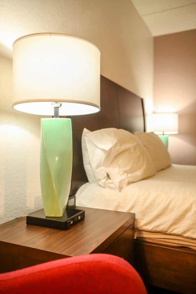
| Fabric shade (linen, cotton blends) | Diffuses light broadly and warms its appearance; noticeably softens visible source brightness | Bedside and floor lamps, guest room ambient light |
| Frosted or opal acrylic/glass diffuser | Scatters light evenly with minimal color shift and higher diffuse transmittance than fabric | Vanity sconces, semi-flush ceiling fixtures, corridor fixtures |
| Etched or sandblasted glass | Softens the visible source while passing more total light than a dense fabric shade | Decorative pendants and accent ceiling fixtures |
| Perforated or louvered metal | Controls the direction of light and blocks a direct view of the source, but adds little diffusion | Track lighting, wall-wash and accent fixtures |
Serviceability matters here too. A shade or diffuser in a guest bathroom or corridor faces humidity, dust, and frequent cleaning in a commercial setting, so the material’s durability is as much a specification decision as its light output. Our replacement lamp shade options and available finishes both factor into that choice.
Bulb CRI: Rendering Color Accurately
Color rendering index, or CRI, describes how accurately a light source reveals the true colors of what it illuminates, on a scale of 0 to 100. The IES defines the general color rendering index, written Ra, as a measure of the average shift of eight standardized colors, chosen for intermediate saturation and spread across the range of hues. The U.S. Department of Energy describes color rendition more simply, as color quality, or how colors appear when illuminated by a light source.
CRI is a separate measurement from correlated color temperature (CCT), the warm-to-cool scale most specifiers already know. Two fixtures can share the same CCT, both reading as a warm 2700K, while one renders skin tones and fabrics accurately and the other flattens them. CCT tells you how warm or cool a light looks; CRI tells you how truthfully it shows color once it gets there.
CRI matters for visual comfort because a space can hit every lux and UGR target and still feel subtly wrong if the color rendering is poor. Skin tones look off at a vanity mirror. Food looks less appetizing under F&B lighting. Fabrics and finishes read differently than they do in the showroom. That mismatch reads as discomfort even when glare and light levels are both within range.
There’s no single CRI number required by code for hotels, and the right target is project-dependent. One commercial-lighting specification guide notes that general commercial spaces are commonly specified at CRI 80 or higher, while healthcare and food-retail environments are often specified at CRI 90 or higher, because color accuracy has a direct effect on how skin tones and food actually look. Guest bathrooms and F&B areas in a hotel sit much closer to that second category than a back-of-house corridor does; treat that distinction as a starting point for your own specification, not a fixed rule.
Lumens: Matching Output to the Space
A lumen is the unit that measures how much visible light a source puts out in total. The IES defines it simply as the SI unit of luminous flux. The U.S. Department of Energy frames it more practically as a measurement of light emitted by a lamp, noting that a 100-watt incandescent bulb emits roughly 1,600 lumens as a rough point of reference.
Lumens and lux answer different questions, and it’s worth keeping them separate. Lumens describe the total light a source produces. Lux, covered earlier in this guide, describes how much of that light actually lands on a surface, once distance, fixture optics, and the shade’s diffuse transmittance are all factored in. A high-lumen bulb behind a dense, low-transmittance shade can under-deliver on the room’s lux target; a modest-lumen bulb behind a well-designed diffuser can meet it comfortably.
This is also where lumens connect back to glare. A higher-lumen lamp increases the visible brightness of the source itself, not just the light on the work plane. Pair a high-lumen bulb with a shade that doesn’t diffuse well, and the room can hit its lux target while still producing an uncomfortable UGR, because the bare source is brighter than the shade can soften. The fix isn’t to guess at a lower wattage; it’s to specify the lamp’s lumen output and the shade’s diffusion together, as one decision rather than two. Our commercial LED bulb options are specified with this pairing in mind.
How to Design for Visual Comfort in Hotel Spaces
Visual comfort is built during specification, long before a guest checks in. It comes from fixture choice, shielding, shades and diffusers, mounting height, and how you layer ambient light with task and accent light.
A diffuser is a translucent cover that spreads light and softens a bright source. The space-by-space guidance below shows where these choices matter most.
Guest Rooms and Bedside Lighting
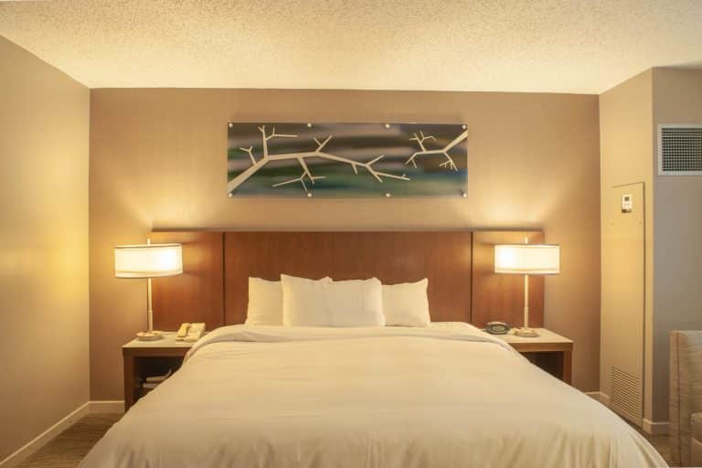
Guests notice glare fastest at the bedside, where a bright bulb sits close to eye level as they read. The fix is to position and shield each source so light reaches the page or nightstand, not the guest’s eyes.
Shaded sconces at the correct mounting height keep the bright bulb out of view while a guest reads in bed. Our guide comparing nightstand lamps and headboard sconces weighs the bedside options that keep a bright bulb out of a guest’s sightline. Aim the light down toward the pillow, and keep the shade bottom near seated eye level so the source stays hidden. A fabric shade with good diffuse transmittance does much of this work on its own, softening the visible bulb before mounting height and aim even come into play.
Adding dimming lets guests drop the level for evening use. Thoughtful wall sconce placement balances brightness across the room and softens the contrast between a lit lamp and a dark wall.
Bathrooms and Vanities
A vanity needs even, shadow-free light on the face with low glare at the mirror. Harsh downlight alone carves shadows under the eyes and chin, and this is one of the few areas where bulb CRI has a direct, visible effect on the guest experience: skin tones read accurately only when the light source renders color well.
Place sconces beside the mirror, or above it, and use diffused sources to spread the light. Sconces mounted at roughly face height on each side of the mirror light both cheeks evenly and cut the shadows a single overhead source leaves. Selecting hotel vanity lighting built for the bathroom keeps the face evenly lit, and specifying a higher-CRI lamp for that fixture keeps it looking true.
Also check the finish and serviceability, because vanity fixtures face humidity and frequent cleaning in a commercial setting. A sealed, wipeable finish holds its look through daily housekeeping.
Corridors, Lobbies, and Public Areas
Overhead layers in public spaces should deliver even illumination without hot spots. A single bright fixture in a dark corridor creates glare and uneven pools of light.
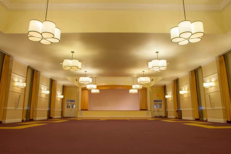
Shielded or diffused ceiling fixtures spread output more evenly overhead. Our semi-flush ceiling fixtures suit corridors and rooms with limited ceiling height. Spacing them evenly along a corridor keeps light steady from door to door and prevents dark gaps between bright pools; matching lamp lumen output to the fixture’s diffuser, rather than over-lamping and relying on the shade to compensate, keeps that evenness consistent fixture to fixture.
In lobbies, shade pendant lighting softens the source while supporting wayfinding and safe movement without harsh brightness.
A Quick Specifier’s Checklist for Visual Comfort
Use this checklist to turn visual comfort into specification decisions.
- Confirm the fixture’s UGR value and whether the source is shielded from direct view.
- Match lux to what happens in the space, using desk targets for work areas and softer levels for rest.
- Confirm the shade or diffuser material and its diffuse transmittance, not just its appearance.
- Specify bulb CRI deliberately, holding guest bathrooms and F&B areas to a higher standard than back-of-house spaces.
- Match lamp lumen output to the shade’s diffusion and the fixture’s shielding, not to the room’s lux target in isolation.
- Place bedside and vanity fixtures so bulbs stay out of the sightline, and position overhead fixtures to avoid direct glare.
- Give guests and staff control over levels by adding dimming.
- Choose finishes that hold up under commercial cleaning cycles.
- Repeat the same comfort standards across every property in a program.
Conclusion: Building Comfort Into Every Fixture
Visual comfort is a specification outcome that you plan for during design. You reach it by setting glare targets, controlling light levels, and getting the fixture-level details right: the shade or diffuser’s diffuse transmittance, the bulb’s CRI, and its lumen output, specified together rather than as separate afterthoughts.
This is the work Mario Contract Lighting has done since 1922. We manufacture custom, contract-grade fixtures for guest rooms, corridors, lobbies, and vanities, and we have completed more than 14,000 projects since 2000. Explore our hospitality lighting solutions to see how we build comfort and durability into every fixture.
Frequently Asked Questions
What is visual comfort in lighting?
Visual comfort is lighting that lets people see clearly and relax without glare or eye strain. It comes from managing brightness and contrast so no single source overpowers the eye.
What is a good UGR value?
The WELL Building Standard asks that workstations and seating areas reach a UGR of 19 or less. Many designers use 19 as a comfortable reference and confirm the right target for each space.
What is the difference between discomfort glare and disability glare?
Discomfort glare is the annoyance from a source that is too bright in your view. Disability glare is scattered light that actually reduces how well you can see.
What is CRI and why does it matter for hotel lighting?
CRI measures how accurately a light source renders true colors, on a scale of 0 to 100. It matters most in guest bathrooms and F&B areas, where skin tones and food need to look accurate.
How many lumens does a hotel fixture need?
There’s no single lumen number for every fixture; it depends on the space’s lux target, the fixture’s optics, and the shade’s diffuse transmittance. Specify lumen output and shade material together rather than choosing one and assuming the other will compensate.
How do you reduce glare in a hotel guest room?
Position and shield bedside fixtures so light reaches the page instead of the eyes. Then use shades or diffusers to soften the source, and add dimming for evening use.
Explore our Custom Capabilities or schedule a consultation today.