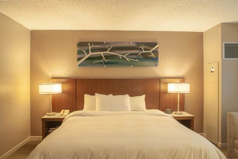
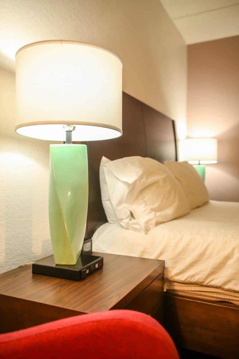
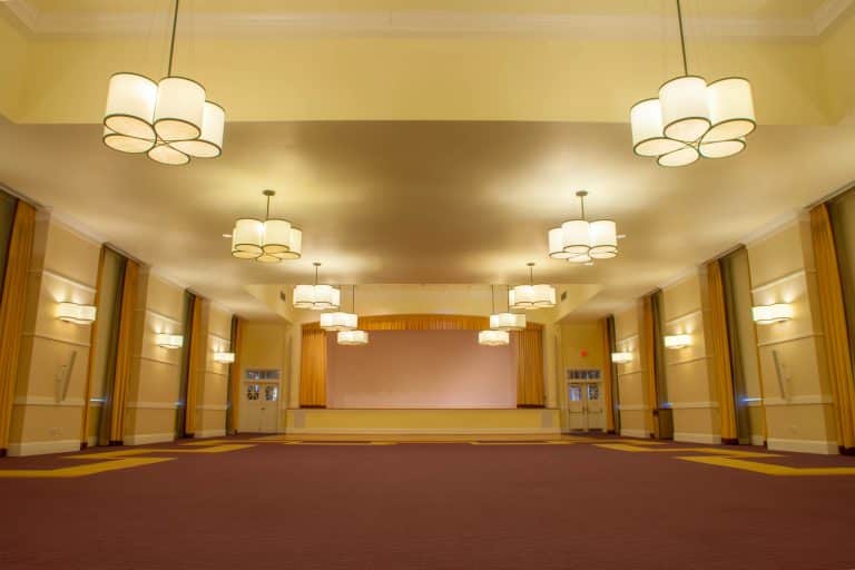
When guests walk into a property, they don’t separate the details into categories like lighting, furniture, or signage. They experience everything together, as one story. That’s why signage should never feel like an afterthought. It should belong to the interior just as much as the millwork, the finishes, and the light that shapes the room.
When typography, materials, and illumination speak the same language as the interior design, guests move with confidence, and the space reads as intentional rather than assembled.
Building a Design Language
Signage design begins with choices that echo the larger concept. A warm, approachable interior complements humanist letterforms. A clean, modern space calls for geometric type. Serifs communicate heritage and calm.
Materials deserve the same care. Match metal tones to hardware and lighting trims so edges appear consistent across sightlines. Establish hierarchy with scale and weight, making primary destinations easy to read and secondary details naturally follow.
When these elements align, wayfinding becomes a story that unfolds from entry to rest. A consistent grid ensures predictable margins and balanced line lengths, reducing effort for guests who may already be tired from travel. Limiting the palette to a handful of finishes and one accent tone—perhaps drawn from upholstery or stone—creates a rhythm that supports the interior rather than competing with it.
When Illumination Matters
Not every sign requires light, but at the right moments, illumination enhances both utility and ambiance.
- On guest floors, illuminated room signs provide visibility at night, support staff checks, and create a gentle halo that flatters wall finishes.
- In daylit corridors or boutique properties, non-illuminated room signs maintain a calm wall while still providing strong visual contrast.
- At exterior entries, porte cochères, and street frontages, illuminated signs for hotels reinforce the brand and help visitors spot the property quickly from vehicles and ride-sharing services.
Accessibility Begins on Paper
Accessibility isn’t something to solve during installation. It should be designed from the start. Mounting heights, clear floor spaces, and tactile requirements should be coordinated with door hardware schedules so crews are building from a unified intent.
The right materials also matter. Matte backgrounds with legible type are more effective than glossy surfaces that bloom under downlights. Contrast can meet accessibility standards without clashing with the interior palette.
Details That Protect the Look
Signage takes daily abuse, so its details should anticipate impact. Concealed fasteners or backer plates aligned to grout lines keep the look seamless. Edge returns and rounded radii help resist chips from luggage or carts.
When signs are illuminated, power feeds should be coordinated with the same care given to decorative lighting. Mockups confirm brightness and control spill, preventing glare before production.
Signage should also integrate with wall systems. Align plaque sizes to panel modules so that they frame the message cleanly, rather than cutting through it. On fabric-wrapped or acoustic walls, adjust standoffs to keep edges crisp. On stone, test adhesives, and consider metal backers that spread the load and allow easier replacement later.
Quiet Coordination Moves
The smallest adjustments often make signage feel truly part of the room. Match plaque corner radii to those of tables, mirrors, or fixture canopies. Tie the thickness to the shadow lines used on cabinetry or headboard reveals so depth feels consistent. On patterned wallcoverings, shift plaques slightly to avoid breaking a motif.
Signage as Part of the Family
The best interiors treat signage as part of the same family as furniture and lighting. A brushed brass plaque beside a satin brass sconce feels curated, while a mismatched tone suggests an accidental look. Custom wayfinding signs should be reviewed alongside case goods and decorative fixtures so that the guest journey feels cohesive—from the first step inside to the final turn toward a guest room.
CTA: Want signage that integrates seamlessly with your interiors? Explore our Custom Capabilities for illuminated room signs, non-illuminated options, and lighted hotel signage that extend your design language across every guest touchpoint.